Hi Everyone! If you missed parts 1-3, you can see them
HERE,
HERE and
HERE.
As you, I'm sure already know, I love model homes and I like being inspired by them. I hope you will find some inspirations for your own home too.
Today I'm showing you the upstairs of residence 2.
We'll start with this super neat woodland/camping themed room. What a great idea!
The raccoon and log accent pillows are a very clever touch. (You can see the raccoon better in the first picture.) The tree pattern on the accent wall would be pretty easy to copy with a pencil outline. The lamps would be easy to DIY with twigs and hot glue.
Cute camp style chair and framed camping posters.
There is an attached "Jack and Jill"bathroom. It starts with
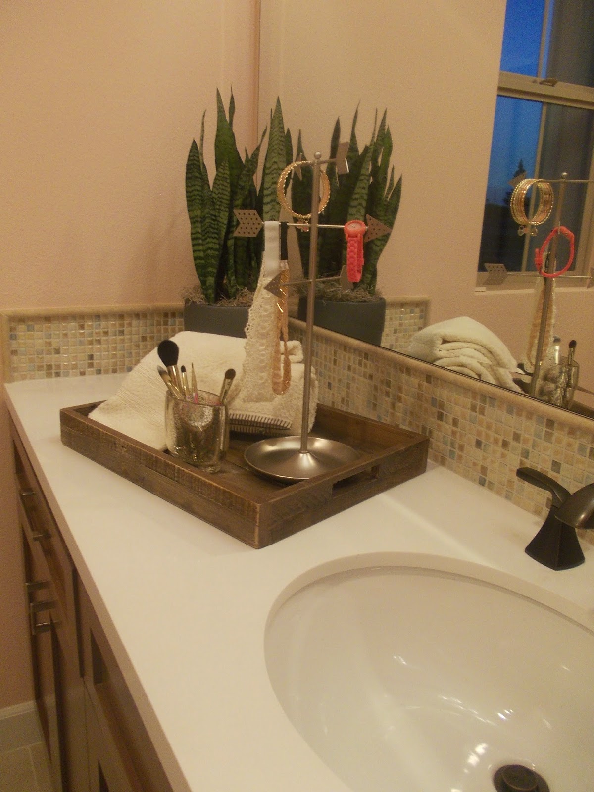
a sink and vanity for the camping style room.

Then turn the corner for a shared shower and toilet....
turn another corner for a second sink and vanity area for a girls room.

Super cute girls room! I like the wallpaper, Which is more affordabley done on only one wall.
Model home lamps can be very high end price wise and can really blow a budget,
I've seen tutorials on how to make capriz shell lamps out of wax paper on Pinterest. They look pretty good and pretty real. There are lot's of different types of lamp tutorials out there. It's worth looking into and can save a lot of decorating money.
Some easy personalization crafts are the volleyball sign, which looks like it can be applied with sharpies and the magnetic memo/picture board which looks like you can transform an old picture with magnetic paint and get the same affect.
The mix of patterns adds texture and dimension to this room. I really like the embroidered quilt.
Here we are at the master bedroom, It has an earthy, natural feeling, very cozy. I like the iron lamp.

I also like the wooden accent wall. The padded headboard looks like it could be easy to replicate or at least easier than a tufted headboard.

All of the art work in this room are posters of textiles, but they look real. It would be fun to take your own photos and have them blown up into posters. You could use textiles or pretty much anything your heart desires!

I like the vinyl chair covers. I like the inside out seams.

Here are a couple of pics of the master bath.
I like how they mixed the different wood tones together in the beadroom and bathroom, rather than making everything matchy-matchy.
This Weeks Features
Don't forget to grab a featured button!
1. PLEASE. LINK. BACK. Please include a direct link back to my blog party.
2. Feel free to link up any of your masterpiece's whether they're crafts, recipes, decor, thrifty finds, etc. (Please no direct links to etsy or other sales sites.)
3. Please do not pin from the party, go to the original blog and pin from there
Have a blessed week,


