Hi there!
I know, you may be wondering how many of these am I going to do? The answer is seven. There are three model homes in this group. I've broken each one up into two parts. I know that only adds up to six, but in part 7, I'm going to show you the outside patios of all three. You can view parts 1-4
here,
here,
here and
here.
We'll start in the down stairs area of residence one. This model has a home office. They've mixed black paneling and crown molding with white walls and cabinets.

I like the mini fridge and counter area.

These two paintings are the inspirations I'm currently using to create art
work in my office/craft room right now! I hope they turn out looking similar. It looks like they painted these together as one and then flipped one upside down. Maybe I'll do that too.

Right outside the office is this simple little bathroom. What makes it cute is the wall paper, artwork and nice hand towels.
I've had wallpaper before and basically do not want to go that route again. However, if I did, I would probably try a small half bath or one accent wall. I like this natural pattern and neutral color, which could be switched out easily with any accent color.

And on to the kitchen.
Have you ever wanted to add a bright color to your decor, but you don't want the commitment?
Sometimes it's a little scary to add colors like yellow, orange, red, etc. I like the way model homes use colors like that as accent colors. All of the walls, flooring and furniture are in neutral colors.
The accent color in this home is red and can be found on books, (I like the cookbook holder. I think I might have to make one like this!) Red bowls and jar lids. What a cute and easy jar to DIY for kitchen storage, genius!
The pantry door is painted red and makes a big statement without too much commitment.
And a few red kitchen items here and there, which can so easily be switched out.
There is a really cute dinning room area with mixed/matched furniture. I have to tell you, I really like the idea of that. I would never think of doing that on my own. They've put together a black table and light colored wood chairs. I love it.

There's only one wall without windows and they put up board and batten on it. That's a pretty economical way of doing that kind of wall, as an accent and in a smallish room. I love that look and one day I want to try it. I also like the floating shelf and mixed artwork.
The pop of red in the this room are in the artwork and napkins. So Simple!
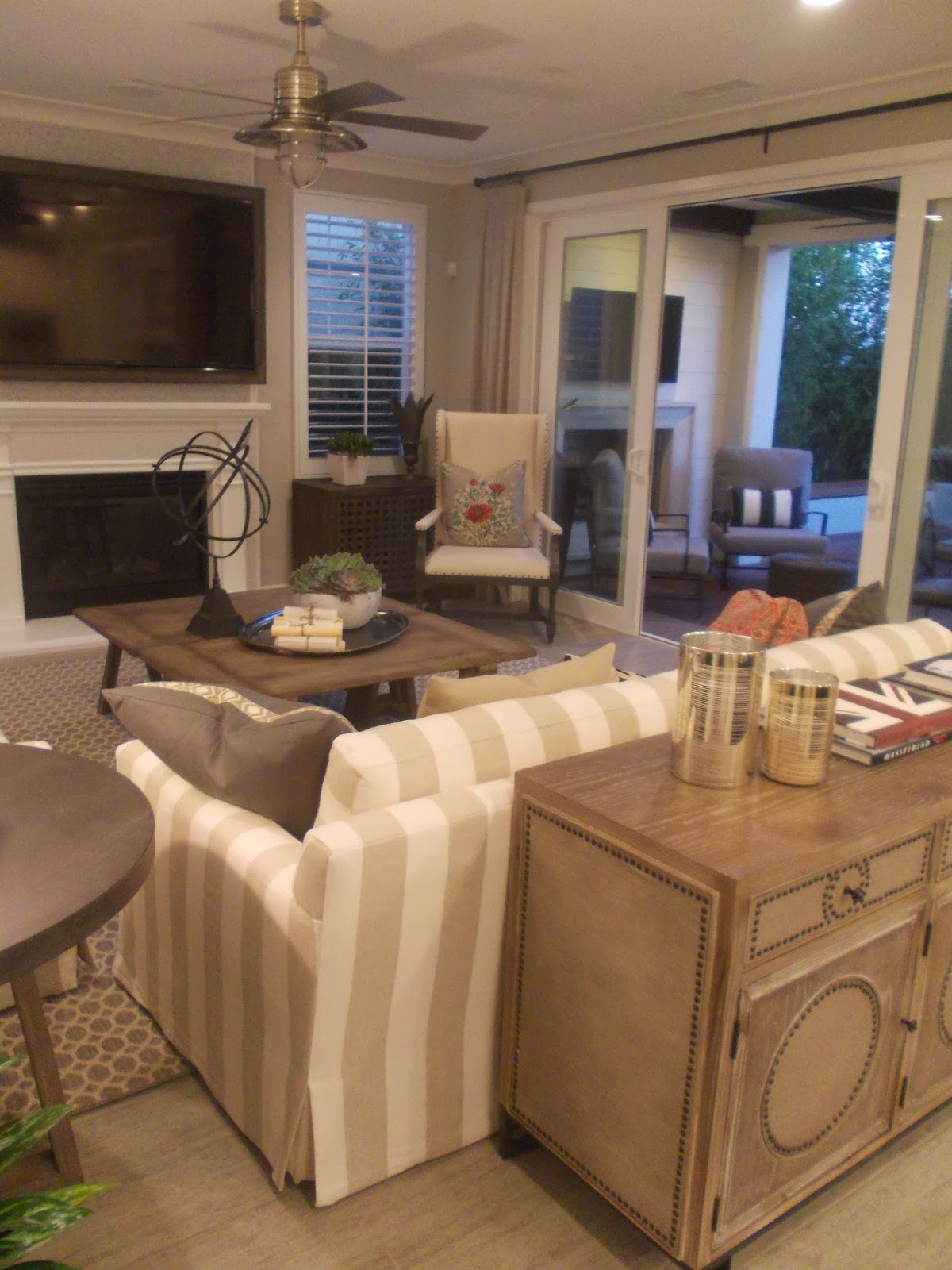
It is the same in the living room, If you removed the artwork, pillows and books, you would have a very neutral room. I love neutral rooms. They have a peaceful feeling to them.

And they can be accessorized at the drop of a hat.

I like how they added board and batten to this one wall in the living room as well. And of course I love all of the nautical touches to the decor. Notice that glass lamp to the left way back there? How easy would it be to glue rope around the base of a lamp? It's pretty cute.
Another clever thing I notice in some model homes is how they will combine two coffee tables into one.
I love this chair and poppy pillow! Next week we'll tour the upstairs.
This Weeks Features

Duct Tape And Denim

Christianity Cove

The Vintage Storehouse

Fabby's Living

The Bajan Texan

Let's Make It Lovely

Home Sweet Home #14

The Darling Touch

Musings Of A Multitasking Mom

A Vintage Green
Don't forget to grab a featured button!
1. PLEASE. LINK. BACK. Please include a direct link back to my blog party.
2. Feel free to link up any of your masterpiece's whether they're crafts, recipes, decor, thrifty finds, etc. (Please no direct links to etsy or other sales sites.)
3. Please do not pin from the party, go to the original blog and pin from there
Have a blessed week,


